
PORTFOLIO
Crafting A Narrative
-
Crafting A Narrative -

Crotcheting 4 Justice was a collaborative mutual aid project of Reaching our Communities Crocheting (ROCC) and the California Immigrant Youth Justice Alliance (CIYJA) to raise commissary and post-detention funds for individuals detained and iIncarecerated by ICE.
The Project
My job was to create an appealing representation of this project through a logo that captured the connectedness that families, organizers and detained peoples can maintain despite the states best attempts to separate them. This is represented by an interwoven ball of yarn that, when unwoven, tells a tale of liberation. Crotchet was as much a skill as it was therapy for many of the people involved in this project, and I was able to capture that with natural, healing colors - colors often unseen by people detained, but reminisced upon as symbols of liberty and freedom.
The Work
During the first month that the Biden Administration took power in the White House, The Dignity Not Detention Coalition was in high gear creating popular education material around rapidly moving immigration policies. In this project, they needed to quickly explain a moratorium policy that was hastily enacted on a Friday evening.
The Project
My job was to package an abstract idea that was quickly being misconstrued in the media, into digestible information that our audience could break down into conversational pieces of information. Because the information was dense, I went with very simple but appealing design, balanced bold striking headings, with playful soft sans-serif body text that read like a set of notes that a college student would take. I hand drew the minimal illustrations seen throughout the graphic to create a more ‘grassroots’ feel, and focused more on the information rather than organizational logos or calls to action.
The Work
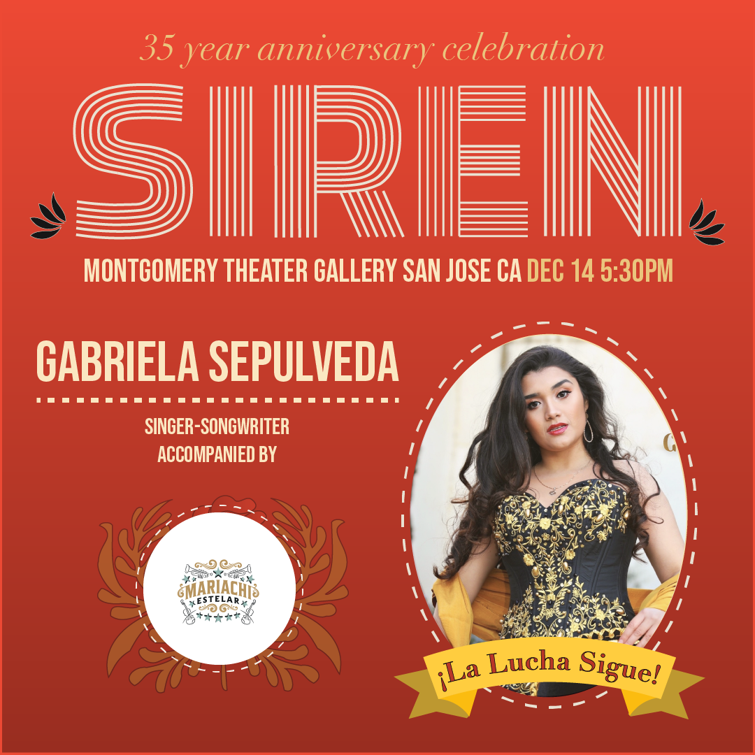

SIREN was celebrating its 35 year anniversary as a legal service organization serving immigrant communities, and the theme of the event was ‘La Lucha Sigue - The Fight Continues.’ They needed an invigorating design that both reflected on the struggles of the past and looked forward to a bolder, better future.
The Project
Nostalgia is a powerful force in our line of work, and I drew inspiration from the 1968 Olympic logo to capture that feeling in this special anniversary logo for SIREN. A representation of both modernity and tradition, the Olympics are a multi-national phenomenon that captures what I believed to be SIREN’s etho’s - broadening equity to all. I paired the logo re-design with SIREN’s bold fire-red logo color, and accented it with bright call-to-action yellow’s, mariachi suite inspired flares around the text, achieving what I believe to be a striking simplicity. Aside from the logo, I also designed the events flyers, posters, merchandise, and event presentation graphics.
The Work


Urban Peace Movement needed a quick turn around informational print flyer to inform its base of the upcoming election for District Attorney in Alameda County. Their targets were young voters (or soon to be voters), who have proven time and time again that they will show up to the polls if they are reached out to in person.
The Project
I created a flyer that focused on two of Oaklands’ greatest assets: Baseball and Hip Hop. The colors are reminiscent of the Oakland A’s, a scheme that you find often on baseball caps, tee shirts, and sweaters around the Bay. I complimented the home team colors with a custom made font inspired by Too Short, E-40, P-Lo and Mac Dre (all Bay Area legends) album covers. While the title hooked in young community members, The rest of the flyer worked at breaking down important, nonpartisan issues in a culturally competent way, using minimal text, inviting design, and a sense of balance that did not favor one over the other, allowing young minds to determine their electoral choice for themselves.